Ernest Hemingway ‘The Sun Also Rises’

¶ 1 Leave a comment on paragraph 1 1 The three images I’ve included are the original book cover/dust jacket (1926), a more recent cover design (2003) and an even newer cover design, and what appears to be the most prevalent design currently (2006). I found upwards of 16 different cover designs since its initial publication. This novel was made into a movie, and at times it was difficult to distinguish between movie posters and book covers. It was also published under the name Fiesta in other countries, which in turn had other cover designs as well.
¶ 2
Leave a comment on paragraph 2 0
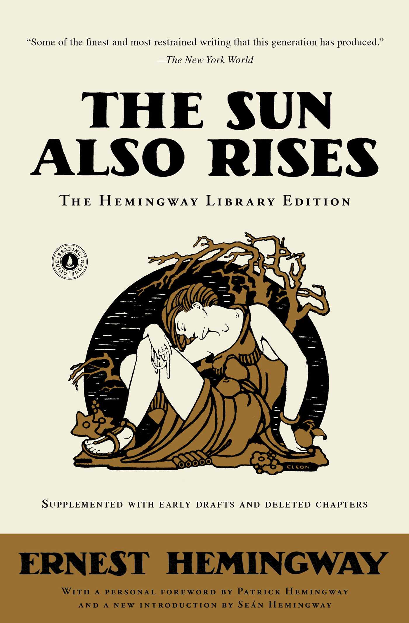
¶ 3 Leave a comment on paragraph 3 0 The first edition book cover/dust jacket was designed by Cleonike Damianakes, who also designed covers/dust jackets for both F. Scott and Zelda Fitzgerald. The Hellenistic design of this jacket was apparently chosen because of its classy and understated sexiness. Because women typically made up the majority of those purchasing novels in the 1920’s, it was thought that this particular design would intrigue and appeal to them. Surrealism and Art Deco (or Style Moderne) were popular within art and design during this time as well, however Damianakes design isn’t particulary reminiscent of those design movements. The bold, clean design, however, does appear to be similar to other book cover designs within the time period. The imagery of the original cover design isn’t very telling in relation to the novel and its story. The colors aren’t particularly bright, nor are there many, but this is typical of Hellenistic style and fits in with Damianakes signature design style. It also fits into the design elements of the era with its muted colors and bold, although clean and simple, lines.
¶ 4 Leave a comment on paragraph 4 0
¶ 5 Leave a comment on paragraph 5 0
¶ 6
Leave a comment on paragraph 6 2

 Most of the cover designs that appeared on newer editions of The Sun Also Rises were much different from the first. Not only in style, but in color, and in the way they reflected the novel itself. The majority of the newer cover designs feature imagery relating to bull fighting, a big aspect of the novel. Although the images of bull fighting change slightly with each new design, the color red is present in all of them. The red is typically present in the form of the Muleta (the stick with a red cloth hanging from it) or the Capote de Brega (the red cape used by the bullfighter), but is also present in the fonts of some designs as well. The 2003 cover shows both the bull and the fighter in a blurred image of a bullfight with red in the form of the font and what appears to be the fighters cape. The 2006 cover, also burred, shows an image of the what appears to be just the bullfighter with his red cape. However, and interestingly, the colors and blurred image on this cover also resemble those of a sunrise, lending a bit of ambiguity and certainly intrigue. Modern readers seem to like, and look for, book covers that tell them something about the story, and this speaks to the change in imagery on the cover. Remodern art has been popular in the 2000’s with its bright colors and blurred, whimsical lines. The two newer designs are reminiscent of this movement in art, and contrast greatly with the bold, clean lines of the original cover art. I was, unfortunately, unable to find who designed the newer covers I’ve posted, so I can’t speak to how they play into their individual style, but as noted, they fit into a larger design trend of the time period.


Movie posters, I suppose, constitute a ‘whole other’ can of worms, but it would be interesting to fold them into this study / comparison, too.