The Lord of the Rings Book Cover

¶ 1
Leave a comment on paragraph 1 1
I”ve decided to go with J.R.R. Tolkien’s The Lord of the Rings. It was first published in 1954 in England with a mere 3,000 copies. All three volumes of the first additions have a jacket cover that was created by Tolkien. 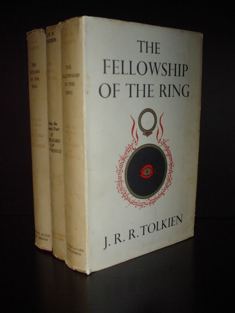
¶ 2 Leave a comment on paragraph 2 1 It has the classic ring of fire or doom and Suaron’s eye. The design in rather simple. The title followed by the ring and the eye beneath and the author’s name at the bottom all laid out on a white cover. Because of this simple design, production costs would be relatively low and much easier to print compared to some of the covers that followed later.
¶ 3
Leave a comment on paragraph 3 0
Following the first release of the Lord of the Rings, a second was released in 1968.
¶ 4 Leave a comment on paragraph 4 1 This second cover is distinctively more colorful and has more design. Though there is no ring on this cover there is so much more to look at that it doesn’t seem to effect the vibrancy that comes with reading this book. Compared to the first one, I do like the first one better. It speaks of the older time that the book is placed in. I haven’t read the books in a while, but when watching the movies I don’t see bright bold colors. What I see are dark solid colors, except when it comes to the elves. But since the story is based around this darkness, I think it’s fitting. I personally would go with darker colors and not so much this vibrant yellow.
¶ 5 Leave a comment on paragraph 5 0 There are many more covers that have been used over the course of this books history and there is simply not enough time to discover them all in an hour. Most of the images that I have seen tend to be darker, solid colors with a simple design on the front.


Do you know which methods Tolkien used to create the original cover artwork? Are we talking about painting, drawing, sketch work, etc? I ask because his design for the covert art of The Hobbit used a kind of engraving technique to give the impression of layers (the Misty Mountains; the Mirkwood Forest; the Shire, etc.). This seems to be a bit different.