The Hobbit Cover Re-Design

¶ 1 Leave a comment on paragraph 1 0 For my re-design of the book cover for “The Hobbit”, I set out to modernize the original book cover that Tolkien designed. I knew that I wouldn’t be able to create anything better than his design, but I wanted to see what it would look like if it was done with modern technology.
¶ 2
Leave a comment on paragraph 2 1
I started with a grey background because of its popularity in design today, especially in clothing and interior design. The next step was to add the mountains, which are the focal point of Tolkien’s cover. I chose black as the color so that th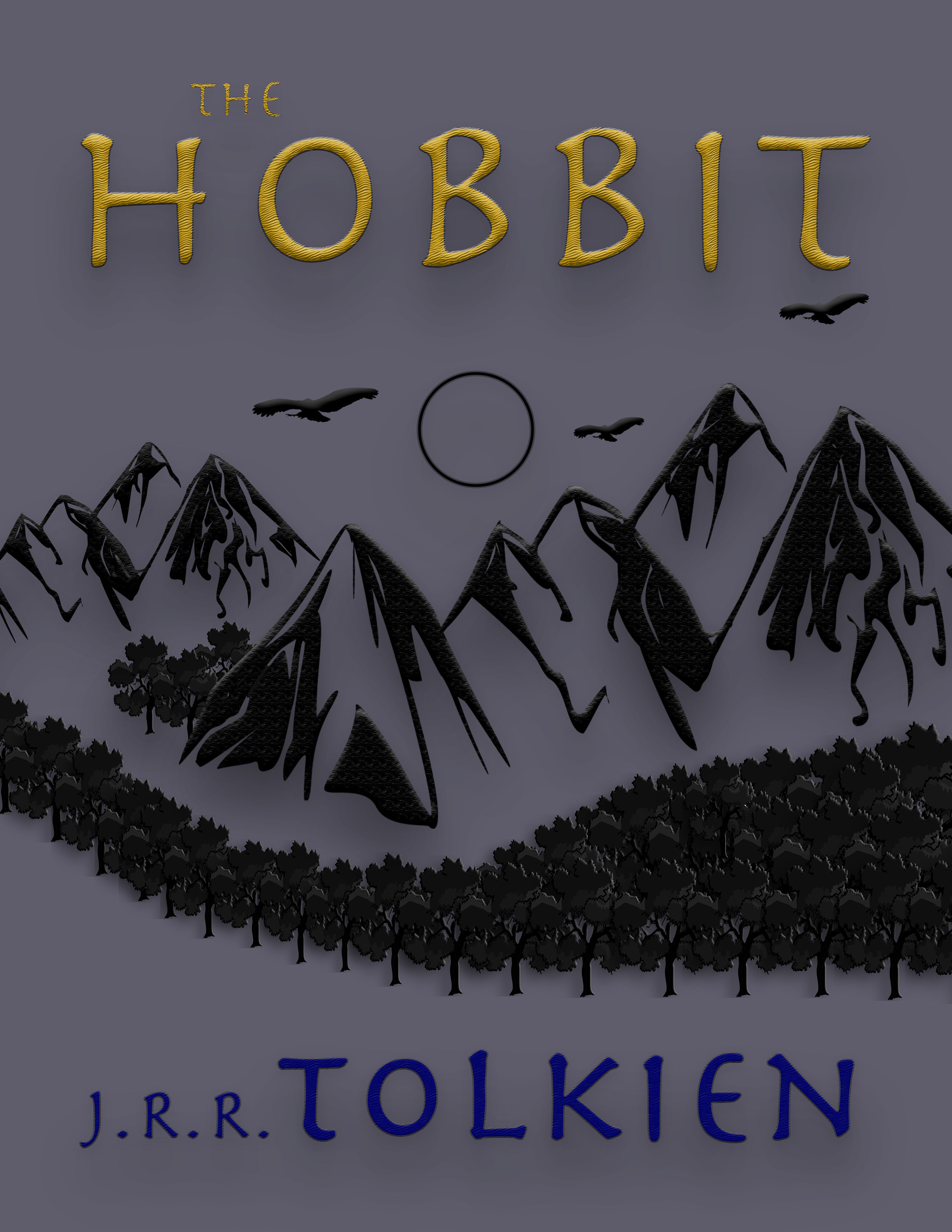 e mountains would pop out of the grey background. I used the emboss and bevel tools to give the mountains texture and depth. This makes them look three-dimensional, which pays tribute to another Hobbit book cover from my blog post that was based on the movie edition.
¶ 3 Leave a comment on paragraph 3 2 I chose a simple circle for the sun, staying true to the original design. I chose black for the sun and the birds flying near it again because it keeps the cover simple and streamlined, which is typical of book covers today. Like the mountains, the birds have some shading and texture for the three-dimensional effect. Finally, I designed a tree with shading and texture to match the rest of the scenery, and I inserted several of them to create my forest. I also spent a lot of time resizing each tree and placing it in the right spot. This process was tedious, but I am happy with the final product. The scene represents the original cover well, but it has a fresh feeling.
¶ 4 Leave a comment on paragraph 4 1 For the title and author’s name, I drew inspiration from both the movie-book cover and the 80’s book cover. I thought that the yellow and blue in the 80’s cover looked tacky, so I wanted to show that yellow and blue could be used in a more tasteful way. The title features a gold color instead of pastel yellow, and I also added a map-like texture to the letters that is similar to the movie-book cover. I chose dark blue for the author’s name because it is more pleasing to the eye than the bright blue of the 80’s cover. I chose the same font for the title and author because I thought it was an excellent representation of the ancient aspects of the story (legends, maps, language) and its adventurous spirit.
¶ 5 Leave a comment on paragraph 5 1 Overall, I still doubt that any book cover could top Tolkien’s original design, but I’m satisfied with my design. The mountain scenery is exciting and whimsical, and I can’t help but smile when I see the new yellow and blue that were so ugly in the 80’s cover. This light-heartedness reflects the essence of “The Hobbit”.
¶ 6 Leave a comment on paragraph 6 0


I really like the route you took with this design of the Hobbit, to me the cover fits with the feel of the book itself and it almost comes off as a bit eerie to me which I am really fascinated by too. I’ve always viewed The Hobbit as a fantasy book I could never imagine myself in, but this book over makes me feel as if I am standing before the landscape in person. I also like the contrast you used between the lettering and the more grayscale background. It really draws your eyes to the title similar to how the ring draws in the wielders attention.