‘Flowers in the Attic’ Re-Covering Design

¶ 1
Leave a comment on paragraph 1 0
For my re-covering of “Flowers in the Attic” by V.C Andrews, I wanted to bring the cover back to its former and hunting glory. As the years passed by, the novel cover looked less and less like the plot with bright co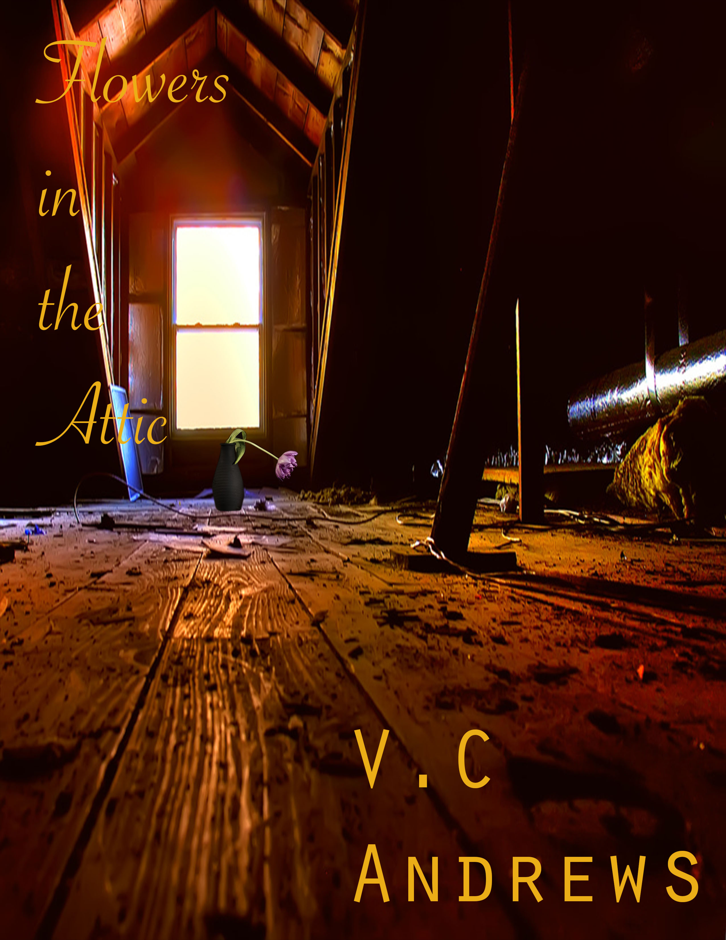 lors, romantic couples looking straight out of a fairy tale. I decided to go with a darker color scheme to showcase the dark themes within the novel and added just enough light to attract readers.
¶ 2 Leave a comment on paragraph 2 3 The main image, the attic, is dark and dirty. In the story, the children are trapped in this attic for years and it’s not a posh attic by any means. They go through dark times and have to overcome many boundaries. I wanted the image of the attic to reflect the description of the book.
¶ 3 Leave a comment on paragraph 3 1 As an English major, I love a good metaphor, which is where the flower comes in. There is a flower in the back of the attic by the window, and though brightly colored, it is turned down and will die soon. I wanted this image because I wanted another visual description of how this story will not be a happy one. I wanted to reiterate the hardships these children will be facing and that even in the brightest light of the attic, the flower still ends up dying.
¶ 4 Leave a comment on paragraph 4 1 The title of the novel is more elegant in script and a little girly, for it was teenage girls who were the first target audience for the book. I didn’t want a harsh font or a font so bold it would take over the overall image of the cover. As for the authors font, I wanted it a little bigger and bolder, for V.C Andrews was a very popular author and has many author books that are coming out with new editions. This generation’s teenagers are more likely to recognize her name and relate that back to previous books they could have read.
¶ 5 Leave a comment on paragraph 5 1 Compared to the previous covers, I think this is a good balance between the older, scary and dark version and the bright and colorful new version. I didn’t want to take away from the dark aspects of the book, but I also didn’t want to have people be too terrified to even pick it up.


It’s been years and years since I’ve read this novel, and frankly, I don’t remember much from it, but I do remember the attic itself, and I think your image emotes the right mood. I like that the attic isn’t horror-esque or overly gothic, but simply gritty and rough. It feels both bleak and realistic, which strikes a nice balance I think.
I think you’ve done a very intriguing take on the book over but also on how you present the attic itself which holds such a pivotal role in the story. Having both read the book and seen the movie as well, I find that this attic image reminds me a lot of how I imagined it would look like in my head. The door scheme you chose was a nice touch too, adding in a bit of warmth despite the inhumane treatment the children experienced. I also like that you chose to pay attention to the romantic aspects of the book which I often think get overshadowed at times. Great work!
We talked in class about how digital tools often disguise the labor that goes into making a given digital text / artifact. In this case, though, I can tell that you put an immense amount of work into this design, and I applaud your willingness to do that. Removing the background in order to upload and embed the flower image, for example, undoubtedly required a fair bit of work. But I like the end result here: the purple flower clashes with overall color scheme (which is red, black, and orange, and reminiscent of hellfire). Good work.