Book Cover Trends for Ethan Frome

¶ 1 Leave a comment on paragraph 1 0
¶ 2 Leave a comment on paragraph 2 1 The original cover for Ethan Frome, published by Scribners in 1911, was a simple red hardcover with the title and author’s name in golden letters. The title had a red box around it and was printed in a larger font than Edith Wharton. This simple design was the norm for that time period in America because printing in multiple color tones was expensive. I know this because I read a biography about Dr. Seuss where they discussed his tendency to only use three-six colors a book. He may have wanted to use more but multi-color printing was expensive and would have raised the final price of the book; I am assuming that transfers over to the novel industry as well. Hardcovers, of course, were also more common than paperbacks because they needed to be durable.
¶ 3
Leave a comment on paragraph 3 1
Since 1911, paperback editions of Ethan Frome have become much more popular as the public prioritizes weight and convenience over durability. Most covers available now contain a vast array of colors, although publishers tend to stick to drearier color schemes. In 1986, Ethan Frome became public domain so there was a surge of publishers adding it to their classics list and reprinting it with their own covers. Many of these covers are very similar; they showcase the depressing winter landscape of the farm Ethan lived on. Take the 2005 edition from Penguin Classics, for example. The cover emphasizes that it is a classic, with the author and title on a simple one-color background, but the rest of the cover is an impressionist painting of a scarce winter landscape, as could be found in New England. This kind of cover is the most common for Ethan Frome by far but it doesn’t seem to encourage the reader to open the cover.
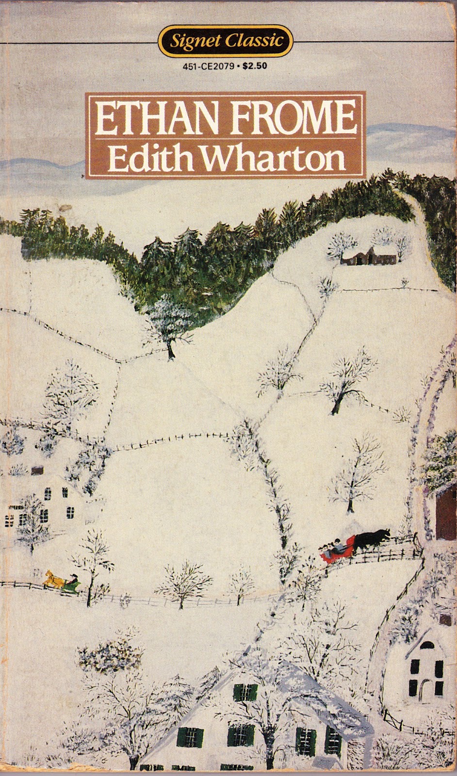
¶ 4 Leave a comment on paragraph 4 0 We can also look at two different editions from the same publisher. Signet Classics added Ethan Frome to their line-up right after the private rights expired. So we have one edition from 1987 (left) and one from 2009 (right).
¶ 5
Leave a comment on paragraph 5 0

¶ 6
Leave a comment on paragraph 6 0
¶ 7 Leave a comment on paragraph 7 0
¶ 8 Leave a comment on paragraph 8 0
¶ 9 Leave a comment on paragraph 9 0
¶ 10 Leave a comment on paragraph 10 0
¶ 11 Leave a comment on paragraph 11 0
¶ 12 Leave a comment on paragraph 12 1
¶ 13 Leave a comment on paragraph 13 0
¶ 14 Leave a comment on paragraph 14 0
¶ 15 Leave a comment on paragraph 15 0
¶ 16 Leave a comment on paragraph 16 0
¶ 17 Leave a comment on paragraph 17 0
¶ 18 Leave a comment on paragraph 18 0 The two book covers differ drastically from each other. Once again, the setting is highlighted above anything else but its portrayal has changed. The 1987 cover, instead of an impressionist painting, looks almost like a child’s cartoon drawing of the setting. I don’t quite understand that editorial decision but by looking at the other Signet Classic covers of the 1980’s, it appears that they wanted more simplistic, straight-forward covers. The drawn footpaths on the cover also accent a sense of connectedness, whereas the other covers depicted isolation. The childish appearance of the cover makes this 1987 version my least favorite of all the covers for Ethan Frome I have seen.
¶ 19 Leave a comment on paragraph 19 1 The 2009 edition seems to follow the path of Penguin Classics, Wordsworth Classics, and Dover Thrift Editions in showing the physical setting of the story through impressionism but it does use a warmer color scheme that seems to imply more hope and less doom. I enjoy this 2009 cover from Signet Classics the most out of all the covers I have seen because, more than anything, Ethan Frome is a tale of a choice between duty and self. Ethan had a choice; he may have made the wrong one but he was never destined for eternal suffering, as some readers erroneously infer from the unforgiving landscape. Ethan does have a terrible life but it was never his preordained fate. I think this book cover emphasizes that possibility and I would like to further emphasize it in my own book cover. The 2009 edition also adds “Pulitzer Prize-Winning Author” above Edith Wharton’s name, which I think is a reflection of a generation that isn’t readily familiar with her name so the publisher is trying to establish credibility and authority.


Yes: this was the standard design for Scribner’s hardcovers from this time period. The result is that all of Wharton’s early novels (she was with Scribner’s for the first 15 years of her publishing career) look exactly the same. Red leather, gold trim, gold lettering on the title.