Ethan Frome New Book Cover

¶ 1 Leave a comment on paragraph 1 0 When I first heard we would be remaking book covers, my plan for Ethan Frome was to draw a kitchen hutch and place significant objects from the story on it, such as books from Ethan’s college years, the pickle dish, and some farming equipment. I planned to have Mattie’s scarf and a sled leaning against the hutch. However, my Photoshop skills aren’t quite there yet and the assignment was to use pictures from Creative Commons so I changed my approach.
¶ 2
Leave a comment on paragraph 2 0
In line with many other Ethan Frome covers, I decided to use a winter landscape as my main image. However, instead of going with an impressionist 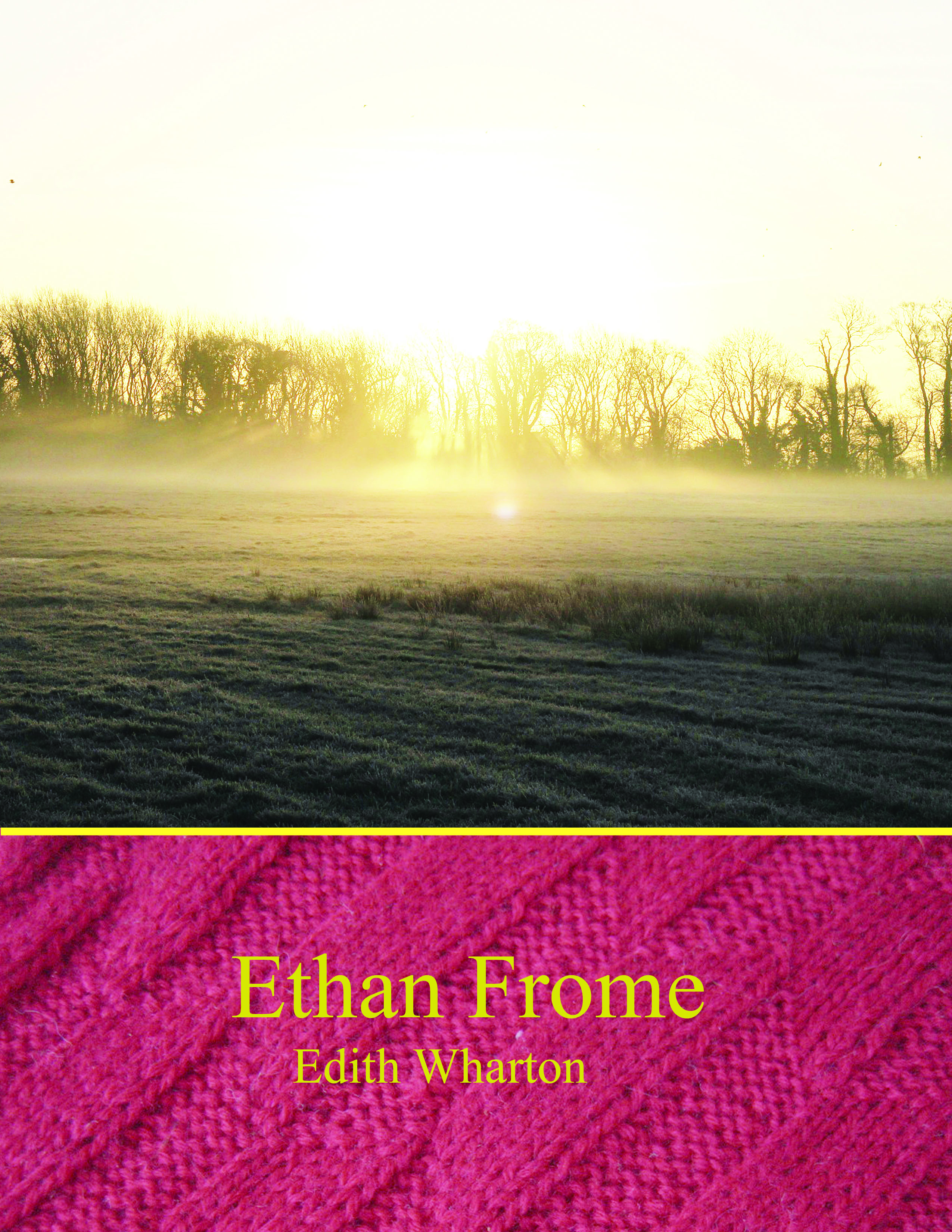 painting, I decided to use an actual photograph in order to update the image (no one uses impressionist paintings as covers anymore, unless the book is really old and/or British). Also, I choose an image of a foggy sunrise over a frozen field to emphasize different things. I wanted the sunrise to emphasize hope; the hope Mattie gives Ethan and the chance for a new beginning that Ethan could have had if he had done things differently. The story is one where Ethan wanders away from the duty he feels he has to his family and to Zeena so the fog is supposed to convey the confusion Ethan feels about choosing his happiness or duty. Lastly, the frozen field is similar to previous covers in that it emphasizes the unforgiving landscape of New England and the difficult farming life Ethan leads. In other words, the ground is duty, the sun is hope, and the fog is the confusion between.
¶ 3 Leave a comment on paragraph 3 1 I made a separate title/author section of the cover to follow the standard used by many publishers in their Classics Series. I used a zoomed-in picture of a red scarf as the background, to once again put the focus on the vibrant life of Mattie (initially) versus the cold life Ethan and Zeena lead. I originally heightened the contrast to make the scarf look darker and sadder but it actually made it look super vibrant, which doesn’t fit the story since hope does not win in the end. So then I lowered the contrast and brightness to give it a sort of distressed look. It’s not super obvious [and the color on the blog makes it look funny] but I was hoping the faded scarf would allude to the ending. I put a golden line between the two backgrounds to make the boundary clear and the title/author names are both in gold as well. I used gold to parallel the sun in order to once again emphasize the contrast between happiness and duty and the choice Ethan must make. I picked Microsoft Himalaya as the font for both the author and the title because I thought it looked clean-cut and old enough to be fitting for such a classic. The final product is nothing like I first pictured but I’m satisfied with it and I think it would encourage readers to open the cover more than some of the current versions.


Nice work here. I found the red color scheme a bit jarring at first (in comparison to the someone colorless image of thew wintry landscape) but, after reading your blog post, I saw the logic of both the color choice and the image. Maddie’s red scarf! How great!