Flowers in the Attic – V.C Andrews

¶ 1 Leave a comment on paragraph 1 1 V.C Andrew’s Flowers in the Attic was published in 1979. With just a simple google search, I have found over a dozen different covers and dust jackets for this novel, dating back to 1979 and then also having a recent book cover released in 2013. The original cover of the book reflects the 1980’s era of literature and design. The authors name is in bold in a large font at the top and the title of the novel on the bottom, also in bold. In between the texts is a picture, integrating hand drawn art, early computer design an photography. The novel has dark themes within it and the book cover reflects the story and could be attracted to teenagers or adults looking for a dramatic read.
¶ 2 Leave a comment on paragraph 2 1 The 2013 version does not reflect the story in any way. The new cover is depicted towards young adults who are looking for a romance novel. Realistic couples almost kissing with a bright light behind theme screams 2013. Though it is an attractive cover that depicts the era, it does not represent the overall theme or story of the book. The people on the cover look picturesque and perfect and it might as well say “This summer’s romance read” at the bottom.
¶ 3 Leave a comment on paragraph 3 0 Comparing the two, they look like different books completely. While the 1979 cover looks like a thriller and drama with it’s dark colors and haunted photo of a girl stuck in the attic in the background, the 2013 version looks like a sappy teen romance full of happy characters and love. Though I understand that this generations teens are looking for that dramatic romance novel, as Twilight had just finished being popular, it doesn’t make sense to me to advertise it in such way. Looking at the cover, you wouldn’t expect death, abandonment, abuse, rape and incest to be main themes but yet it is.
¶ 4 Leave a comment on paragraph 4 1 Reader’s in 1979 knew what they were buying when looking at this cover and the teenagers in 2013 would have been totally blindsided.
¶ 5 Leave a comment on paragraph 5 1 In between 1979 and 2013, you can see the progression of trying to market this book in the present times. They start to make it look less fake, with the girl in the attic being taken out, and more mysterious with girls with their backs turned facing the house. In 2009, with the release of Twilight‘s more minimalist look, only the title, author, and small orange flowers against a black background are shown. The book cover has definitely kept with the times to try and keep appealing to the young adult audience, but along the way they forgot the story.
¶ 6 Leave a comment on paragraph 6 0 1979 Cover
¶ 7
Leave a comment on paragraph 7 0

¶ 8 Leave a comment on paragraph 8 0
¶ 9 Leave a comment on paragraph 9 0 2009 Cover
¶ 10
Leave a comment on paragraph 10 0

¶ 11 Leave a comment on paragraph 11 0 2013 Cover


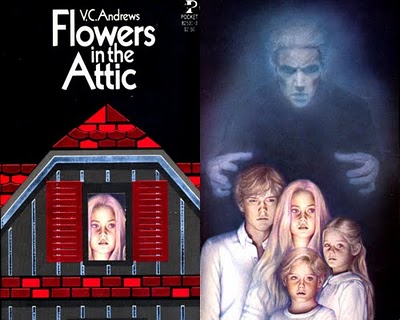
The prominence of the author’s name on this early (1980s) edition seems to indicate that VC Andrews was already “A Big Deal” by this point in time.
Too, the kind of imagery included on the 1980s edition — combined with the font, color scheme, and style — do a lot to advertise this book as, well, unliterary. What do you think? What genre conventions appear to be represented by the imagery and color scheme? Is this a romance novel? A horror novel? Something in between?