New and improved Neuromancer cover

¶ 1 Leave a comment on paragraph 1 0 Neuromancer has had problematic covers throughout its history. From the problematic covers of the 80’s that have not aged well, to the most recent covers which seam rather bland and didn’t really seem to convey anything about the theme of the book. This is a shame considering the book is considered to be one of the best science fiction novels ever written and excellent novel in any genre. I decided to change that with my cover for the Neuromancer.
¶ 2 Leave a comment on paragraph 2 1 I decided to convey the grim tone of the novel by using a dark color palette. I chose to alter using a rasterization filter to give the images to give the skyscrapers a surreal feeling, to represent the blurring of reality from the novel. I originally wanted to go with a modern Chinese cityscape as an homage to the opening of the novel, but it was too difficult to not make the cover overly busy feeling. This in and of itself isn’t a problem, but more of a reaction to not go with the overly busy covers on a lot of science fiction novels.
¶ 3 Leave a comment on paragraph 3 1 I choose to also use a stock photo of a stylized brain to further the point of reality might be different that what you perceive. I used the same raster effect from the skyscrapers to keep the style consistent. I then used a zoom blur on the brain to give the cover a sense of motion and action.
¶ 4 Leave a comment on paragraph 4 2 I chose a stark white font to contrast the darkness of the cover. I did this to draw attention to the title and the author of this novel. The font used was Helvetica the reasons for this font were many and entirely subjective. My first requirement was a sans serif font. I think they look better in large print than serif fonts. I then narrowed it down to Helvetica. Once again this was down to personal preference. There were several other fonts that would’ve worked well, but I like the feel of German precision with this Swiss font.
¶ 5 Leave a comment on paragraph 5 0 I will say that a lot of my choices were in response to covers if looked at in my research into both the previous Neuromancer covers and in science fiction in general. A lot of them aren’t very good in my opinion, so my goal was to attempt to right some of the perceived wrongs.
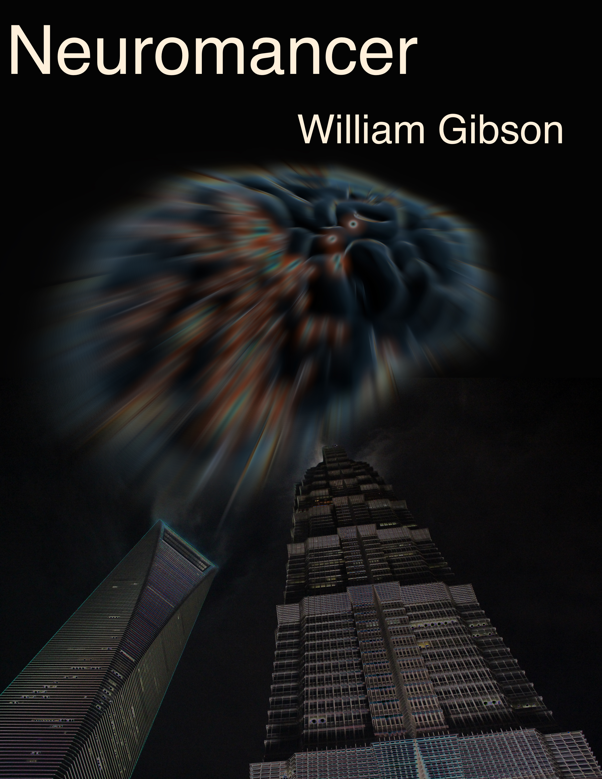





The dark color palette does the grim tone justice. The bleakness of the sky adds to this effect. I like how the cover is is not overly crowded and busy but is still able to invoke lots of emotion in a viewer.