Redesigning Goyen’s _The House of Breath_

¶ 1 Leave a comment on paragraph 1 0 William Goyen’s The House of Breath, first published in 1950, is a novel that defies easy description. To begin, it lacks a clear sense of both plot and characterization, presenting instead a series of vignettes (Goyen calls them “arias”) that are heavily informed by the specifics of setting. Thus, while Goyen’s characters appear to be somewhat anonymous, and while their actions do not comprise a “story” in the strictest of senses, Goyen’s novel most certainly takes place somewhere, and that somewhere is Texas.
¶ 2 Leave a comment on paragraph 2 0 The House of Breath opens upon an abandoned house located on the outskirts of Charity, Texas (based on the real-life town of Trinity, Texas). Goyen’s protagonist — if one can even call him that — returns to the house, which was his childhood home, following years of absence. There, he rummages through the contents of the house and indulges in memories of the past, slipping in and out of consciousness, ceding his place as narrator and letting the voices of other characters, including his own family members, “invade” his mind and body. The result is a highly splintered narrative of the most untrustworthy sort; the reader learns early on that she cannot place any kind of faith in Goyen’s narrator(s), who spin a series of tales that collectively read like riffs on a theme of abandonment.
¶ 3
Leave a comment on paragraph 3 0
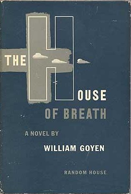 It is with this sense of “abandonment” in mind that I approached the task of redesigning a cover for Goyen’s The House of Breath. When the novel originally appeared in the 1950s, it did so with the help of a very plain and very innocuous-looking navy blue cover (left). A few cloud-like wisps adorn the H in “House” and so offer the barest of nods to the concept of “breath,” or effervescence, or ethereality. But given the controversial history surrounding Goyen’s text — the novel includes somewhat frank discussions of male homosexuality which, at the time of publication, were enough to invite the wrath of the censors — the inauspicious design of the original cover ends up looking like, well, like a cover. That is to say, the original cover is so banal in its design that it appears to suggest that something much more interesting (and much more licentious) lurks inside. Goyen later went onto recant some of the content published in The House of Breath, in part because he had been, as he puts it, “just about disinherited” by his family and by the residents of Trinity. When the book was republished in 1975, Goyen provided an introduction explaining his decision to “downplay” some of the original erotic content. It wasn’t until 1999 that the original text of the novel was restored and published once again, though it featured it a similarly bland, innocuous cover.
¶ 4 Leave a comment on paragraph 4 1 For my book cover design, I wanted to play up the themes of abandonment and economic depression that haunt the text of The House of Breath. For my central image (below), I chose a photograph that I took in the fall of 2014 while visiting the abandoned town of Sherbrooke, North Dakota. Sherbrooke was once the county seat of Steele County and, at its zenith, was home to a little over 1,000 people. It was abandoned in the middle part of the twentieth century, though, after being slighted by the railroad (which declined to build an extension to Sherbrooke). Sherbrooke’s timeline as a town puts it on par with Goyen’s Trinity which, though not abandoned, fell into similar decline in the mid-twentieth century. An image of a chair that I captured inside an abandoned house in Sherbrooke seemed to jibe with Goyen’s point that, “in order find out what we are,” we must wrestle with the experience of abandonment and must, in turn, “enter back into the ideas and the dreams of worlds that bore and dreamt us.” In The House of Breath, Goyen says that it is within such abandoned spaces that we may “find, waiting within worn mouths, the speech that is ours.”
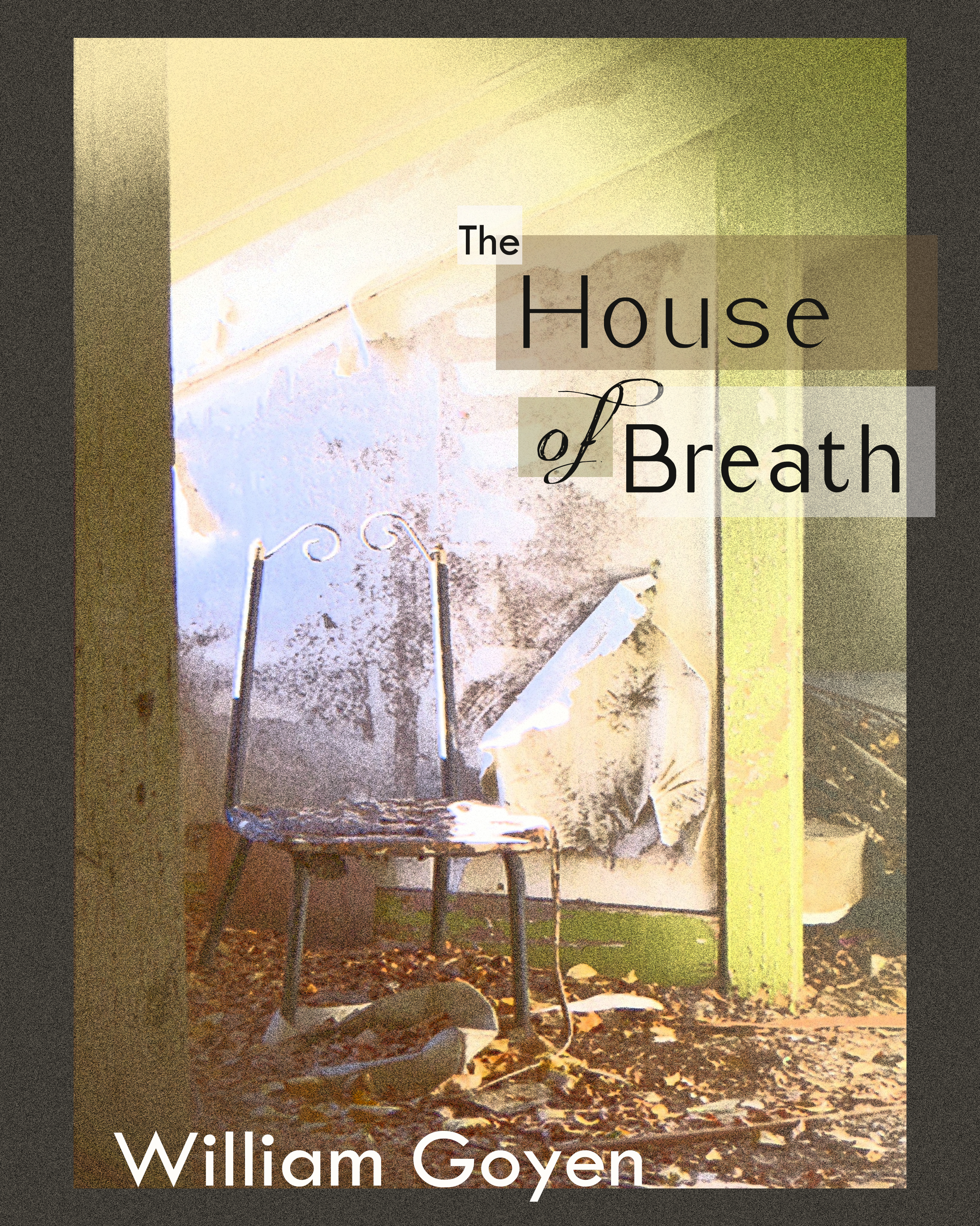


First off, I absolutely love the chair picture and now I’m motivated to go visit Sherbrooke. I agree with you that it emotes a distinct feeling of abandonment and the sad aging of things once beautiful. The autumn leaves scattered on the ground contribute to that decaying feeling as well. One of the things I would maybe change is the filter you applied to the background picture. I agree that the filter creates an drawing-like texture but it also obscures the wall behind the chair. The design just to the right of the chair attracts my attention in this photo because it confuses me a little; it almost looks like there is a picture on the wall. Because I don’t know what the picture is, it draws my attention away from the chair and the leaves to try and interpret its meaning. Unless that wall texture is important to your message or you like the sense of mystery it brings, I would try a different filter that doesn’t make the wall fuzzy (giving it more meaning than it originally had). I do really like the hue of the picture. The yellow gives it a sense of warmth and welcoming despite the actual scene. I also like the arrangement of the words in the title and their different background colors. If I’m right, it looks like each word is a different font, though. As a reader, four different fonts seems a bit hectic and I would narrow the number down to three, including the font of the author’s name as well. Overall, I love it and I think just a few small changes would make it even better.