The Lord of the Rings Cover Re-Design

¶ 1 Leave a comment on paragraph 1 0 When I was looking at all the different covers for the Lord of the Rings, I didn’t know which ones to choose. There were so many of them. The obvious choice was to use the very first cover that Tolkien himself helped design. For being published in the 1930’s, the cover is a basic design. If it were to have been published maybe even fifty years before the cover would be very plain with just the title and probably with a solid background color. As it is, it was published in the 1930’s and as such, with the help and direction of Tolkien, the cover is a nice solid black with yellow detailing as seen below.
¶ 2
Leave a comment on paragraph 2 0

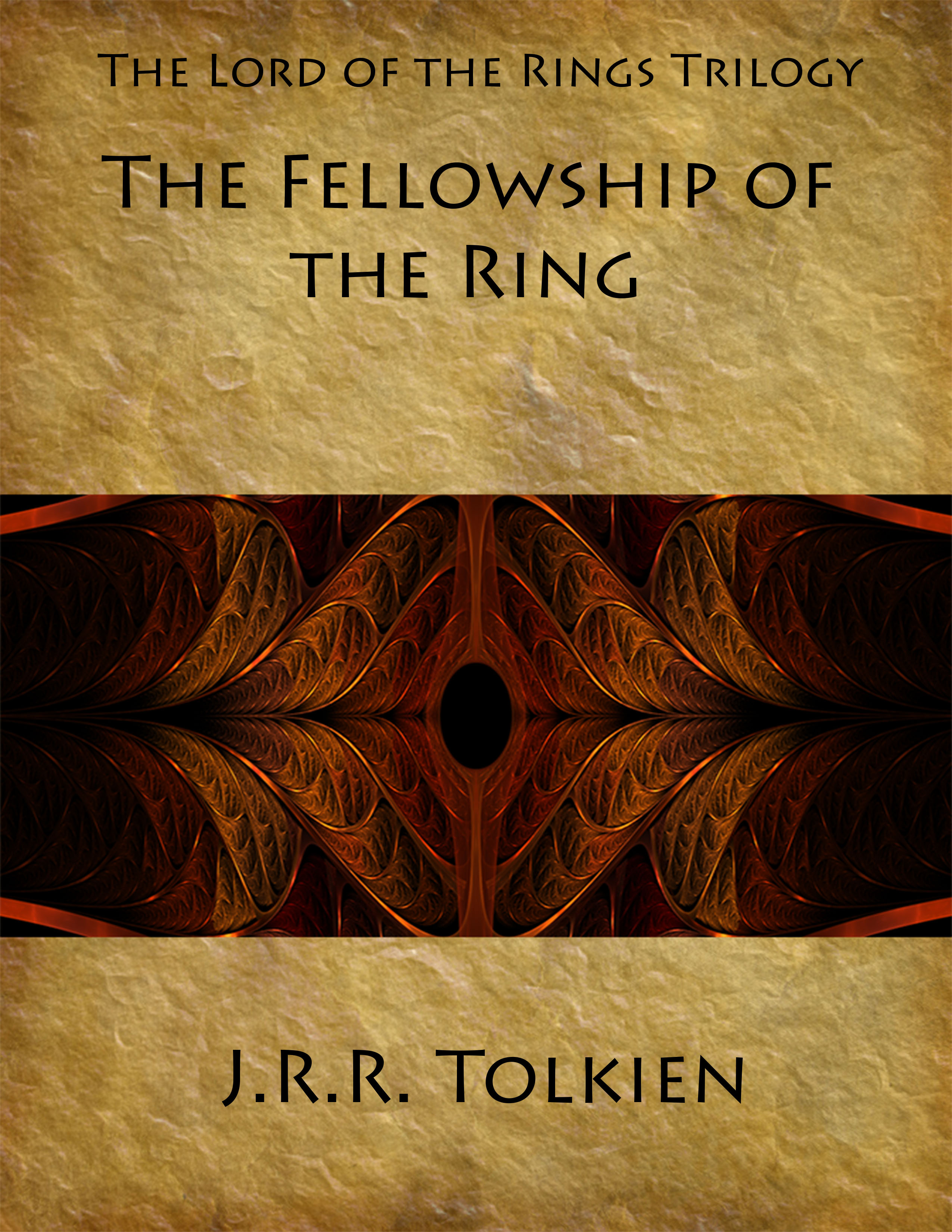
¶ 3 Leave a comment on paragraph 3 0 I had originally planned for my new cover to be dark in color. Based on the book, and the movie which ultimately had no effect on the new cover, my new cover didn’t exactly turn out that way. The Lord of the Rings Trilogy is very dark. Hence the dark colors. But when I was looking through photos to use, I didn’t come across any that I particularly liked. So it took some extra effort at home to find one that I liked and a way to design it. I ended up doing almost the exact opposite of what I thought I was going to do.
¶ 4 Leave a comment on paragraph 4 2 Lord of the Rings final
¶ 5 Leave a comment on paragraph 5 0
¶ 6 Leave a comment on paragraph 6 2 I wanted to stick with the ‘old’ theme. Dark colors would have gotten me there, but just having dark colors can be interpreted many ways. So I decided to be more direct and go with and old sheet of parchment, which the the story is written on – in the book. But old. crinkled parchment isn’t enough. Looking back through the previous covers I remembered that for the original covers for each of the three books, they all had their own distinct color. The first book just happened to be yellow. And old parchment does tend to give off a golden yellow hue. And The Lord of the Rings can’t be Lord of the Rings unless there’s a ring. So naturally I put one in. Though not definitively a ring, it is more oval and in the shape of an eye. Sauron’s eye to be exact. The font that I choose was because it looked old. It was not the usual printed font and would give the cover some angle.



Be sure to upload the .jpg file instead of the .psd file so that we can all see your lovely image 🙂
I think it’s interesting that you chose to feature the eye of Sauron on the first novel in the Fellowship series, given that it doesn’t achieve a persistent presence in this book. But your choice to include it here gives the reader a taste of things to come, I suppose.
Keep in mind that I want to see complete sentences and polished, professional writing in these blog posts. A few of your comments and sentences are incomplete here.