‘The Sun Also Rises’ redesign

¶ 1
Leave a comment on paragraph 1 1
 In my first blog post analyzing the past and current book cover designs for The Sun Also
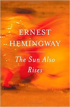 Rises, I included images for the 2003 book cover (on the left) and the 2006 book cover (on the right), discussing the bull and bull fighter imagery present on both covers. I noted the importance of these images and their role within the story as the events taking place involving the characters were often paralleled by the bull fights they were watching. So much of this story takes place within Spain and during the “Running of The Bulls” festival in Pamplona, Spain and these more recent covers are indeed focusing on that sense of placement. Although I again admit the importance of the setting of the story, what I wanted to focus more on in my redesigned cover was the idea of the fights themselves, and less on where these fights were taking place. Although I appreciated the symbolism of the bull, there were so many iterations of bulls on covers (I counted at least 10), that I felt it was a bit overdone, but also I felt that I wouldn’t be able to sufficiently update and improve the image of the bull in any new or exciting way.
¶ 2
Leave a comment on paragraph 2 0
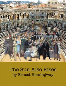
¶ 3 Leave a comment on paragraph 3 1 I wanted to continue to focus on the symbolism regarding the fights, but I wanted to do it in a different way. Where the above images illicit a sense of place (Spain), I didn’t necessarily want to my redesign to do the same. I’ve already noted the importance of the location, but I felt it wasn’t as necessary as the idea of the fights themselves. In order to do this, I did away with the imagery of the Spanish bullfighter and the bull, and instead included a scene of many people. As the people within the novel go about their lives, they are constantly fighting, not only with one another, but also with society as expatriates after WWI. Beyond the literal War that some of the characters were involved in, life itself is a battle where you have to fight for what you want. This is what I take away from the symbolism of the bull fights throughout the novel, and I wanted to present that in my cover redesign. However, I wanted to keep the idea/image of the bull ring, or arena, but without imposing a specific placement. Ideally (read: if my Photoshop skills were better), I would have done away with the scenery in the background of the arena, and focused more closely on the stadium seating, emphasizing the idea of spectators and of the “fight” itself. Although I suppose that there aren’t many bull fighting arena’s outside of places that actually practice bull fighting, I wanted my cover design to suggest that this “fight”, and any spectators, could really exist anywhere. I would have also liked to scale down the people and their party a bit more, showing and layering these two images together at more personal angle. I wanted it to appear as though whoever was looking at this book cover was looking it as if they were seated across from them on the other side of the arena, instead of the overhead view my current redesign portrays. However, given my struggles, I think the main message I wanted to convey is still present in my redesign as it appears above.
¶ 4 Leave a comment on paragraph 4 0 Regarding the color scheme of my cover, I chose to do away with the red that I noted was present in most of the existing cover designs. I went with a color scheme closer to the original cover that was published in 1926, with warm, muted colors. Although the colors of the people in the arena are relatively bright and colorful, they are still a bit muted. These characters live colorful lives and I wanted to portray that without too much of a contrast. As these people continue on with their lives, the sun also rises. I wanted that message to continue on in my cover, but instead of the color red, I chose to include a golden-yellow color, one that I felt still resembled the colors of a sun rise, but without being too much or too bright against the other colors that were already present, and one similar to those colors found in the first cover/dust jacket. This was also done in an attempt to move just a bit further away from the bull/bull fighter imagery of many past cover designs. I suppose my redesign doesn’t necessarily evoke a feeling of modernity, but real photographs simply didn’t have the effect I wanted and honestly, I felt they looked cheesy. Perhaps this was because of the images I was attempting to use, but I felt the painting effect was more in line with my overall intentions for this redesign. I chose the typewriter font because although its classic, it felt more modern to me than anything more script-y like the 2006 cover font.


This is an awesome cover! This is the second time I’m writing a comment, and I didn’t until now peer hard enough at it to see that it looks like the background, the buildings I mean, are really realistic like actual photography, but then the people are cropped in from a different image…Is this right? That is so cool! It’s not even done sloppy it’s shaded and fading in all the right places, cool.
What I love about your cover is that you didn’t make everything such harsh colors like the other editions, like bright red or orange, and yours is instead a subtle, soft cover that plays well with the soft golden tone, which, in turn, plays well with the title, playing on the colors of a sun rising.
The idea you talk about with it being important to you to have a crowd of people at this event verses the other covers that just had one bull fight taking place and depicting that they were indeed in Spain, was a great thought. I like that you wanted it to be more like “we are all separate people fighting our own battles and coming together” type thing, that’s neat. I’ve never read the novel, is that a premise of it? I would definitely pick up this book if it had your cover. Good job!