Alice’s Adventures in Wonderland New Cover

New Cover Design for Alice’s Adventures in Wonderland
Historically the majority of the book covers have always held a classic and traditional feel to them, following the period of time they were associated with during their publishing. Many of these book covers started out with simple designs, often hand drawn that eluded to the idea of more to come. And as time progressed, the amount of detail and hand drawn skill advanced into a more inclusive and detailed aesthetic. Until eventually, the book covers were printed in color and often included digital artwork to reflect the changing times in artistic design and the tools available for use. Many of these new covers are vibrant in color and offer a much more adventurous outlook on what the book is about.
For my redesigning process, I struggled a bit to try and find a creative way to design a book cover that hasn’t been done before. It also took me quite a long time to figure out where exactly I wanted to go with it as well, and what I wanted it to mean. Many of the ideas I played with in the beginning started with a hand drawn aspect similar to the original concepts and designs in the beginning. I also wanted to play with the idea of a tea set and maze. The tea set because it has become such an iconic image when associated with Alice in Wonderland, and the maze because it represents the distortion, confusion and adventure one goes through while following Alice through her journey. However that being said, I found it difficult to incorporate digital photos together to showcase the ideas in my head because they were relatively inconsistent.
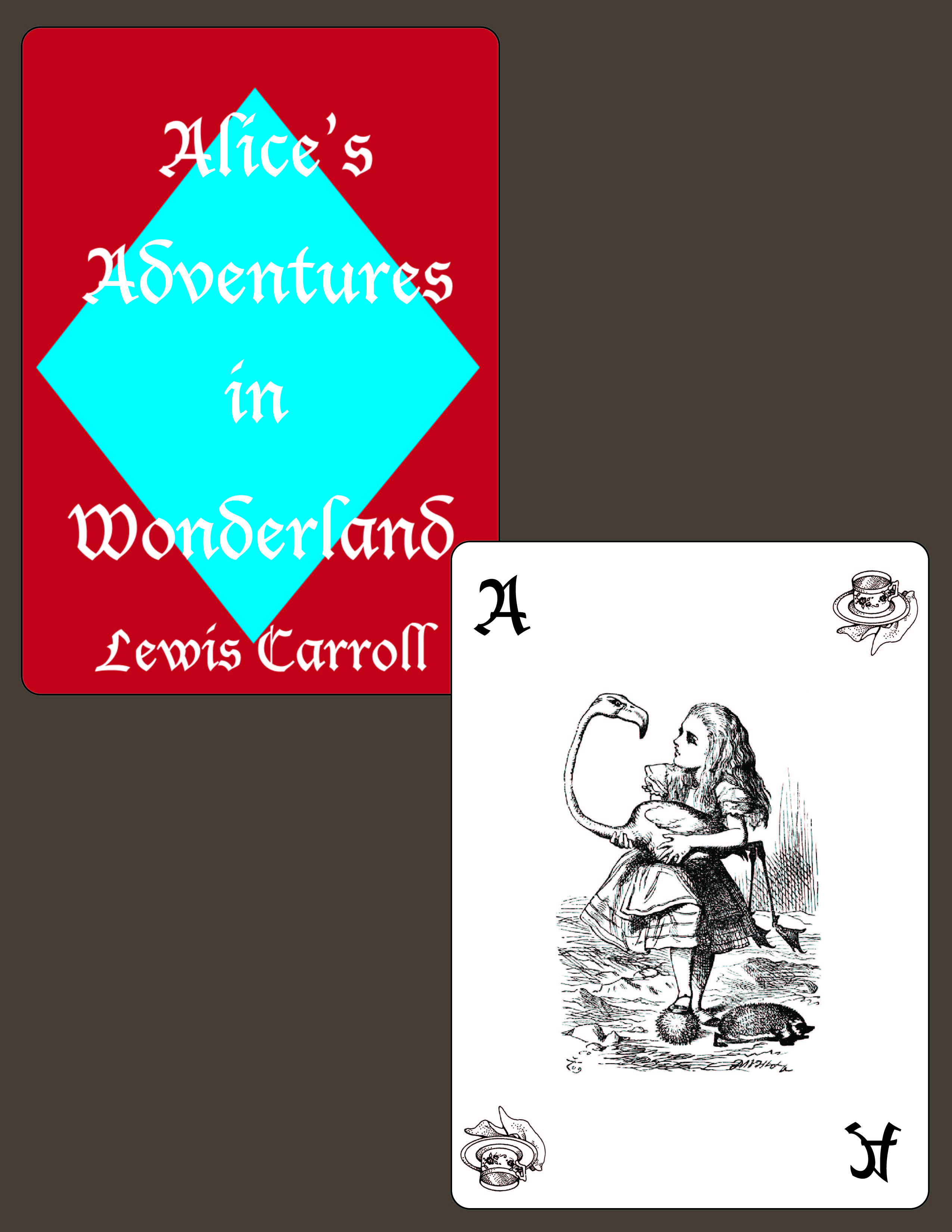
Yet what I found after going back through and re-analyzing a lot of the previous book covers is that there was something extremely satisfying about a simplistic cover. It hinted at just enough detail to intrigue the audience and gave the novel the ability to wow the audiences entirely on its own. So I came to the idea of incorporating a personalized playing card for Alice, since playing cards have an iconic role throughout the story especially in regards to the suites they follow. I designed my own playing card, and used two hand drawn stock images to offer a classic, more traditional feel to the image. I chose a teacup to represent my original design idea and to hind at an image the reader will find when they enter the imaginary world themselves. As well as a traditional image of Alice to offer more a glimpse into the heroine they will be following. I also added a more earthy color as a background so the colors on the playing cards would stand out better and to represent the ground Alice falls through.


Somehow, you winded up composing this entry with the comment function turned off, so I had to edit the entry and add a “Comment Block” in order to reset / enable the comment function. In the future, make sure that you compose with clear paragraphs / spaces and with the comment function turned on so that your peer’s can offer specific comments in response to particular portions of the text.
Regarding your cover design: I wish you had been able to share and discuss this design in class, as I think there would have been plenty to explain and talk about. I like that you incorporated the original imagery from the first edition illustrations, though I’d like to see you explain / analyze this choice a bit more clearly here in your post. Your final design, though, presents the viewer with a lot of blank space, and the text (author’s name / title) is very hard to read, likely because of the white, stylized font appearing on a multi-colored backdrop. I think this design might have been improved through better use of space and text specifications.