Utopia Redesign

¶ 1
Leave a comment on paragraph 1 1
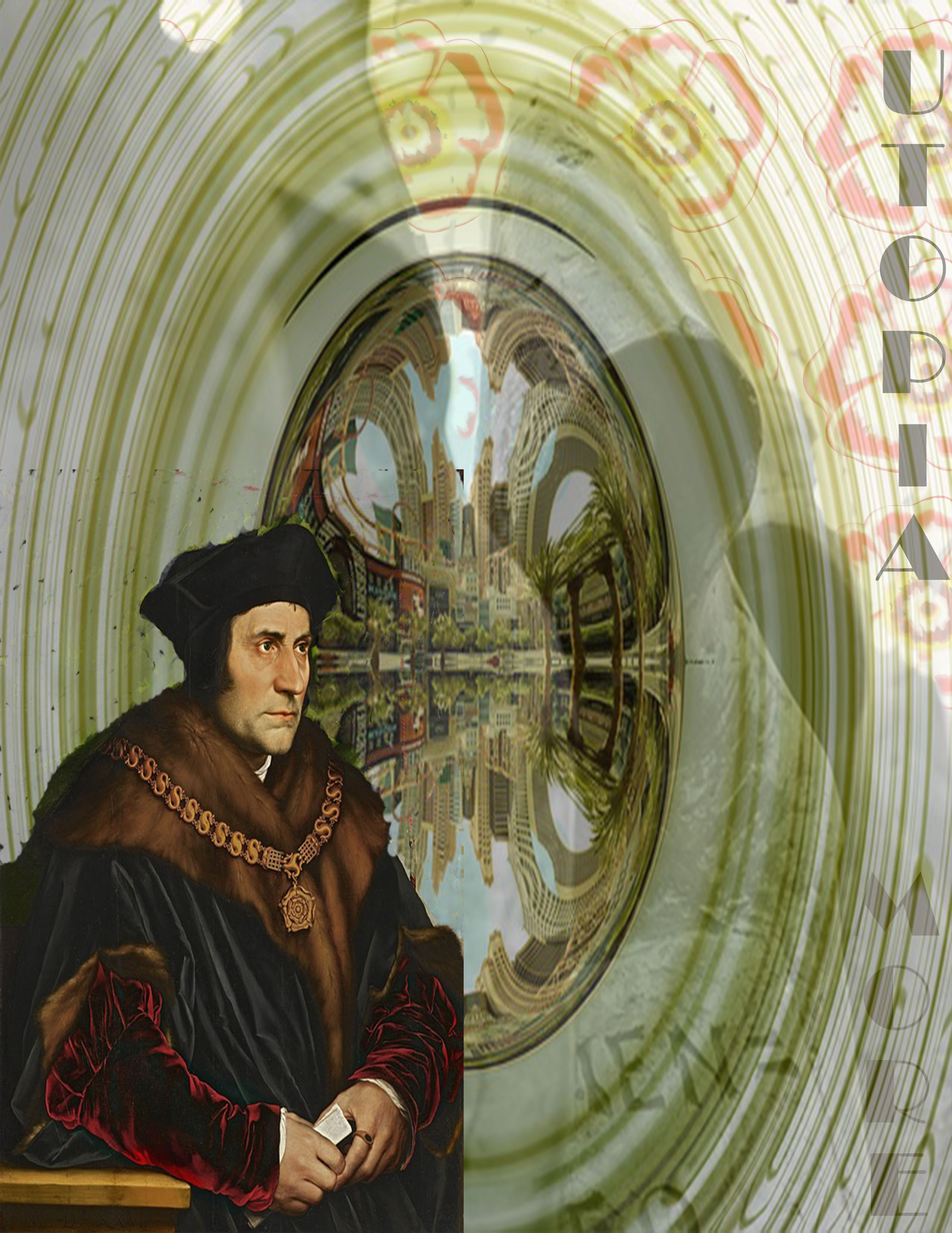
¶ 2 Leave a comment on paragraph 2 0
¶ 3 Leave a comment on paragraph 3 0 The redesign for this book cover was quite an enjoyably frustrating task because I had a million different ideas and also no idea how to use Photoshop prior to this assignment. I reinstalled it on my computer and kept a tab on Google open to give myself some instruction along the way. It worked quite well and I’m happy with how it turned out.
¶ 4 Leave a comment on paragraph 4 0 As I said in my previous post, the pattern among the covers seems to be either More, a map of the island of Utopia, EM geometric shapes, and fancy-shmancy leather bound volumes with either painted or embossed deigns and gold lettering. I wanted to find a way to fuse all four of those concepts together while still making a statement that relates to an aspect of my thesis and potential scholarship as such a thing to my knowledge has not been undertaken before.
¶ 5 Leave a comment on paragraph 5 0 To begin, I started with a white background and found a few free images from creative commons- Tudor Rose, Holbein’s More portrait,an image that popped up when I typed Utopia, and a few images of monks(Carthusian or not). I taught myself how to do a pattern repeat with the rose and made it as transparent as possible. Then I used the background eraser tool on my monks, made it semi-transparent and enlarged it on the background just enough so that some of the roses remained visible. The More portrait was the most difficult of all as I had to ask Hans Holbein to forgive me multiple times for removing the green curtain and marring his epically awesome rendering of one of history’s most noble dudes and I just messed it up multiple times and had to start again. I placed it in the corner of the cover in front of the transparent monks and chose a trippy green background with an idealized city in the middle as the final layer.
¶ 6 Leave a comment on paragraph 6 0 I think this new cover depicts More’s thought process right alongside the Carthusians as both desired a perfect world of sorts and tried to free themselves from the one they knew. While the Carthusians got to stay alive, More ultimately went to his death with the practice that is integral to the Carthusian community: Silence. He attempted to create an imaginary world and it has etched itself in our memories as that which we must consistently strive for as members of humanity, knowing full well that such a thing could never come to pass.


This turned out nicely! I like that Thomas More is able to assume a starring role with this particular cover design, and I like the combination of shadows and textures that you employ here. It lends both a whimsical and sinister aspect to the text.
The title and author are a little difficult to see / read, but I sense that that might be the point. Given the age and popularity of More’s text, it makes sense to concentrate on themes and messages and less on the author’s name, in particular.
Good work.