Catch 22 Book Cover

¶ 1
Leave a comment on paragraph 1 1
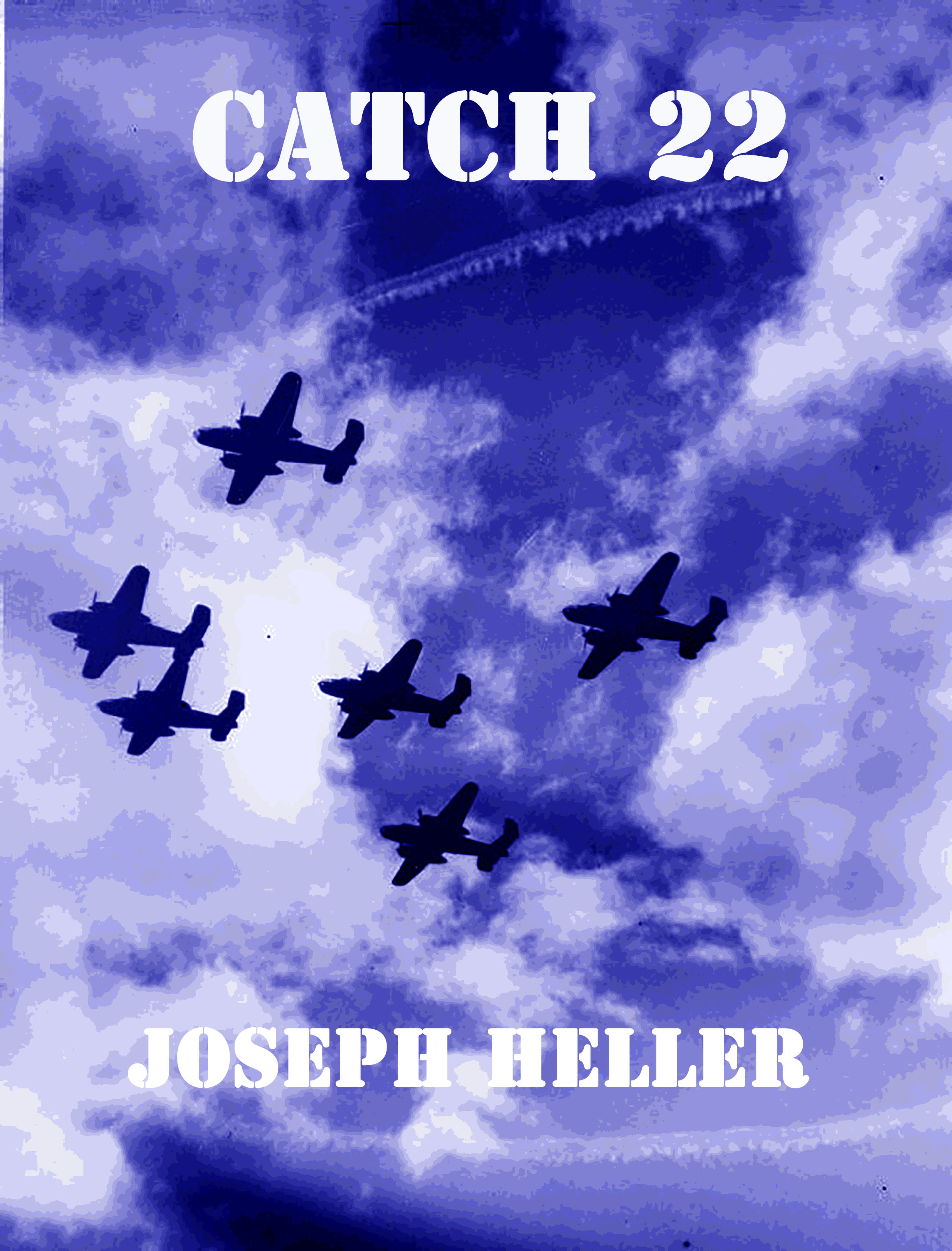
¶ 2 Leave a comment on paragraph 2 0 After revisiting my previous blog post and looking at the numerous covers that have emerged since the first publication of catch 22, I revised my cover from the ideas I had after the first assignment. In my search for images related to world war 2, Italy, Mannequins and whatnot I came across the image that would be the basis for the cover. It was originally a grainy black and white photo of a bomber formation from below. I will admit that I wasn’t overly fond of some of the other covers that featured military imagery, but this one stood out to me when I imagined the characters in the book always looking up to see who made it home after every mission. It isn’t a close enough photo to discern the details present on the plane such as guns or bombs, even after using photoshop to clean up the image.
¶ 3 Leave a comment on paragraph 3 0
¶ 4 Leave a comment on paragraph 4 0 With this image in hand I worked on what elements I thought would make it an appropriate covering for the book with some sense of context in the pantheon of other Catch 22 covers. I kept the iconic bold faced and large font for the title and author, I thought that was a successful element I think all covers future and past should share. I did try to find a different font that I thought might be similar to a script used in a military rulebook; that sort of block, choppy font you see in movies. Failing that I didn’t know what to do with the font until I played with the imagine more.
¶ 5 Leave a comment on paragraph 5 2 The biggest change I made was using a poster effect on the background image. It perfectly illustrated that feeling I couldn’t quite nail with the font individually. I wanted it to look like a recruitment poster you could have seen plastered up during the time period the book was supposed to take place. I changed the font around to fit that typecast, and changed the color so it wasn’t a plain black and white. Blue because it’s a natural sky color, but equally important simply as a nod to the original cover and it’s unforgettable solid blue cover with the white tear away border. Finally, I played with the contrast in the image and the color saturation of the planes to make them pop in the image more. It simply looks better this way, but also serves to highlight an important theme of the novel. The planes are a constant obsession and source of anxiety in the novel, as they are the way out and the danger. Only by flying enough missions can you be removed from danger, but flying is the most likely way to die; an appropriate catch 22.


Have you thought about what kind of audiences would be interested in the different covers? The one you designed would appeal to all kinds of readers. I took a look at your original post, the cover with the dog tags, I can definitely imagine young male readers being drawn to that. The original cover seems iconic, now. I’m not sure if it’s because of its age that it seems less likely to appeal to one group over the other.