Mustaches and Monocles: The short life of Daisy Miller

¶ 1 Leave a comment on paragraph 1 0
¶ 2 Leave a comment on paragraph 2 0 Some of my favorite book covers in the last few years have been minimalist redesigns. For example, lots of designers have taken the opportunity to redesign the Harry Potter set. I am a little surprised that I ended up this way, considering my original plan.
¶ 3 Leave a comment on paragraph 3 0 I was originally frustrated with many of the Daisy Miller covers I found. I tried to find a way to artfully include something else from the story than simply a girl. I tried to think of ways to incorporate the Swiss mountainscape. What about Rome? They have scenery. I had three or four images I wanted to somehow include, but this is a book cover, not a pinterest board.
¶ 4
Leave a comment on paragraph 4 1
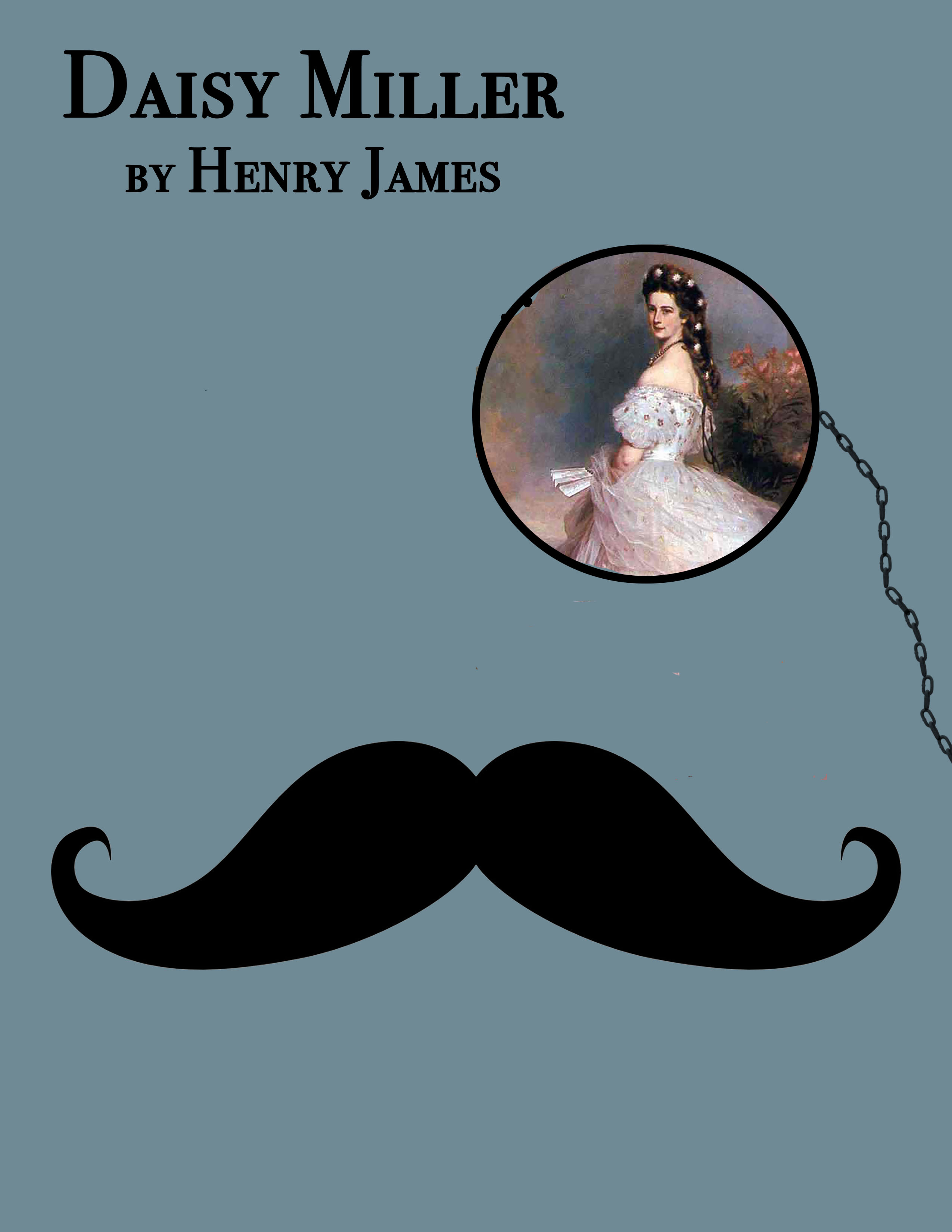
I thought of the idea above just last night and conceptually I like it more. I think if I would have come up with it last week, I could have finessed the finished product a little more. Looking at everything once its done, it is striking me how empty the cover feels. Sure, I went with a simple design so that is to be expected. Maybe I could have filled the space a little better. But I think I feel this way because you would almost never see a cover like this at a store. There would be a price sticker, or a “Soon to be a major motion picture featuring Keira Knightly”. I could have added before the title “from the author of…” Other popular books will have reviews on the cover even. Daisy Miller doesn’t fit into the same category of books as those, so what else might it be missing? Almost all of the book covers I looked into before had a publisher logo. Sometimes I’ll buy a copy of a classic just for the Penguin Classic look, and I’m sure I’m not the only one. I did the same thing when I shopped more frequently at Barnes and Noble.
¶ 5 Leave a comment on paragraph 5 0 Then there’s my thought behind the design: I have always loved the short exchange the characters have on mustaches. Daisy takes on love affairs with two men, Winterbourne and Giovanelli. Giovanelli being a rouge Italian type, has a wonderful mustache, which readers take as a message of sexual virility. Winterbourne takes up the opportunity to make a joke by stroking his own [likely much classier] mustache. Daisy Miller is clearly the focus of the novel, but this is coming from Winterbourne as our focal character. After all, the original title was Daisy Miller: A Study. Who was studying her but Witnerbourne? This cover throws back to that. What is interesting in the concept is it’s kind of a cutesy idea, right? Mustache, monocle, little painting of a girl. It is also almost off-putting because of the blatancy of the male gaze, or to not sound too feminist scholar, a creepy dude staring down some girl.
¶ 6 Leave a comment on paragraph 6 0 It is obvious we will judge a book by its cover. This is especially if you’re looking at the shelf and there are 3 editions of the same book. I think this book would look silly in hardcover [not to mention it is roughly 40-60 pages, depending on the edition]. I imagine my cover to be on a paper back with a sort of matte finish, anything too glossy and I think the dark colors would look strange.



I also appreciate a good minimalist design, and this cover does a fine job in that aspect. In reading your comments, I would agree that the space does feel a little empty. However, I don’t think it needs more in the forefront. I like the fact that the only objects taking up the space are the mustache, monocle, and the title/author. They form a nice balance in the space of the cover.
Perhaps a move lively background instead of the solid color would counteract that empty space feeling. Would it lose that minimalist element if there was one of the landscape images you mentioned incorporated into the background?
The use of the picture of Daisy in the monocle is a great touch. Is that from one of the older book covers? I feel that it grounds the novel ain a particular time period for anyone looking to pick the book up.